
The Art of the Gala: A Four-Year Retrospective on Design & City Pop
When I first partnered with the Japanese Arts Foundation (JAF), the goal was simple: to help throw a great party for a vital organization. Years later, looking back at the body of work, it's become a personal retrospective. This partnership has evolved into an annual creative dialogue, a process of translating a single, powerful Japanese concept into a comprehensive experience.
For me, that experience has two main components: the visual identity (the flyer) and the sonic atmosphere (the vinyl set).
The flyer isn't just an invitation; it's the first note of the evening. It sets the tonal temperature. It has to communicate the feeling of the event, not just the "what, where, when." The challenge is always to take a profound, nuanced concept—like Kintsugi or Kizuna—and give it a visual signature that feels both authentic and modern.
These designs aren't analogue; they are born from a digital canvas. This medium allows for a specific kind of layering and precision, blending photographic elements, vector graphics, and digital textures to build the right mood.
And then, there's the music. DJing these events with an all-vinyl City Pop set is the other half of the equation. The music can't just be "background." It has to be the living, breathing soundtrack to the poster's promise. The design sets the expectation; the music provides the atmosphere.
Looking back, each year was a distinct chapter in this ongoing collaboration.
2022: Kintsugi Gala

The Concept: Kintsugi (金継ぎ), the art of repairing broken pottery with lacquer dusted or mixed with gold. It's a philosophy that treats breakage and repair as part of an object's history, rather than something to disguise.
The Design: This event was a collaboration with the International Museum of Surgical Science. The context was key. The design had to be elegant, almost clinical, yet beautiful. We used a clean white background, letting the gold do the talking. The gold lines aren't just cracks; they are veins of light, tracing the form of a skull—a powerful memento mori that perfectly bridged the gap between surgical science and Japanese philosophy. The typography was kept classic and sharp. It was a design of beautiful, stark contrasts.
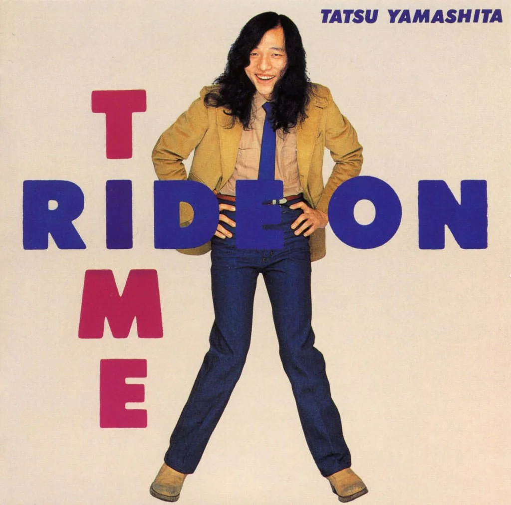
The Vinyl: The DJ set had to mirror this. The music needed to be sophisticated, polished, and soulful. This was a night for the smoother, more refined side of City Pop. Think Taeko Onuki, Miki Matsubara, and the more intricate arrangements of early Tatsuro Yamashita. The sound was rich, golden, and intentional—a sonic equivalent to the precise, golden lines on the flyer.
2023: Kizuna Gala
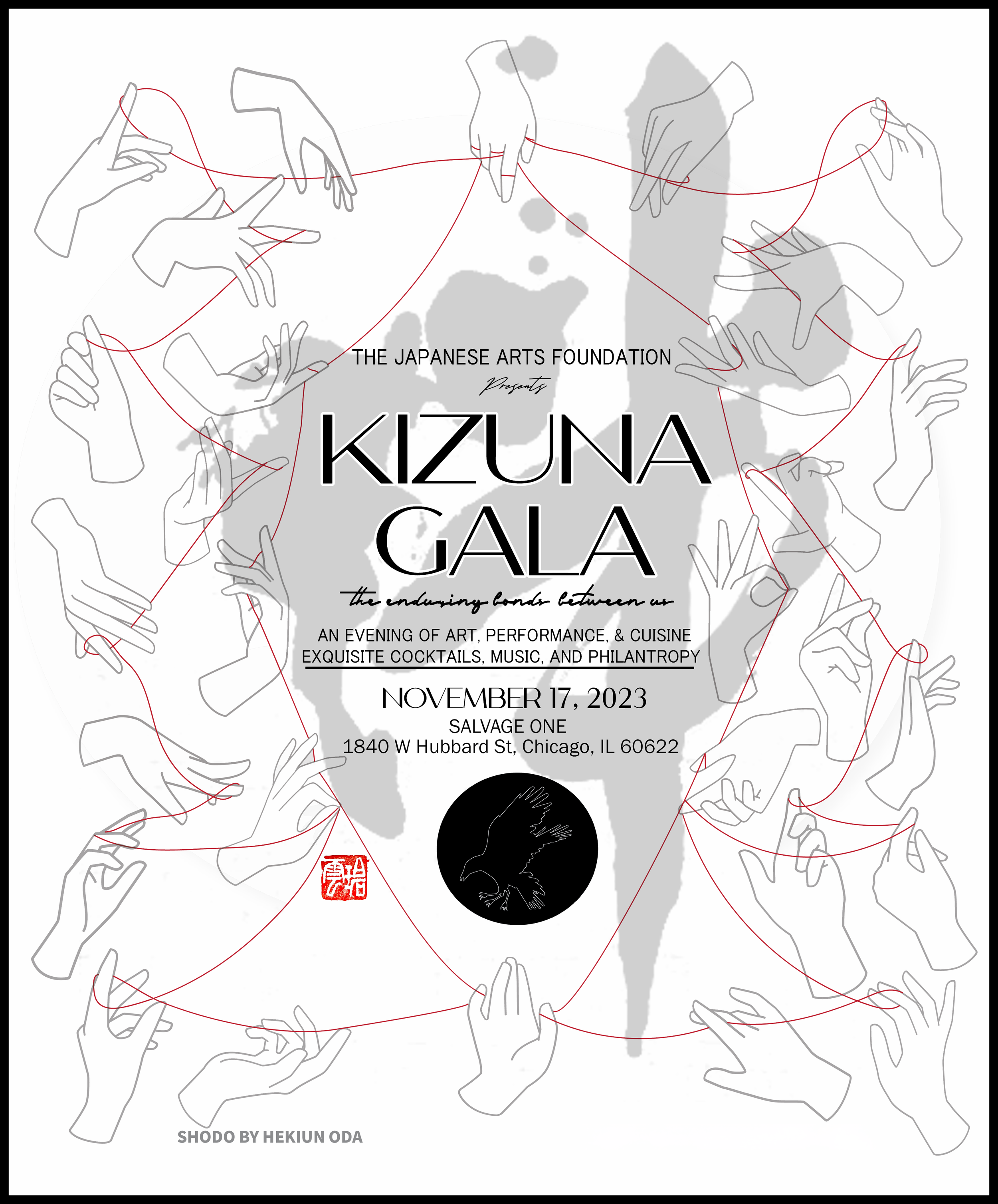
The Concept: Kizuna (絆), the enduring bonds between people. It’s a concept of deep, emotional connection, famously evoked by the "red thread of fate" (unmei no akai ito).
The Design: After the sterile elegance of 2022, we needed to pivot to something human and organic. The design was built around two core elements: the graceful, minimalist illustrations of hands and the kinetic shodo (calligraphy) of Hekiun Oda. The hands reach, intertwine, and gesture, all connected by that single, looping red thread. The composition is a visual representation of a network, a community. The black and white palette keeps it graphic and strong, allowing the red thread—the kizuna itself—to be the undeniable focal point.
The Vinyl: The venue was Salvage One, a space full of objects with history. The atmosphere was warmer, more communal. The soundtrack had to be about connection. This set was more groove-focused. I leaned into the "group sound" feel, playing tracks that invite movement and conversation. This was the night for Mariya Takeuchi's "Plastic Love"—a track that creates its own kizuna, a shared moment of recognition on the floor. The music was about the interplay, the call-and-response, the bond between the rhythm and the listener.
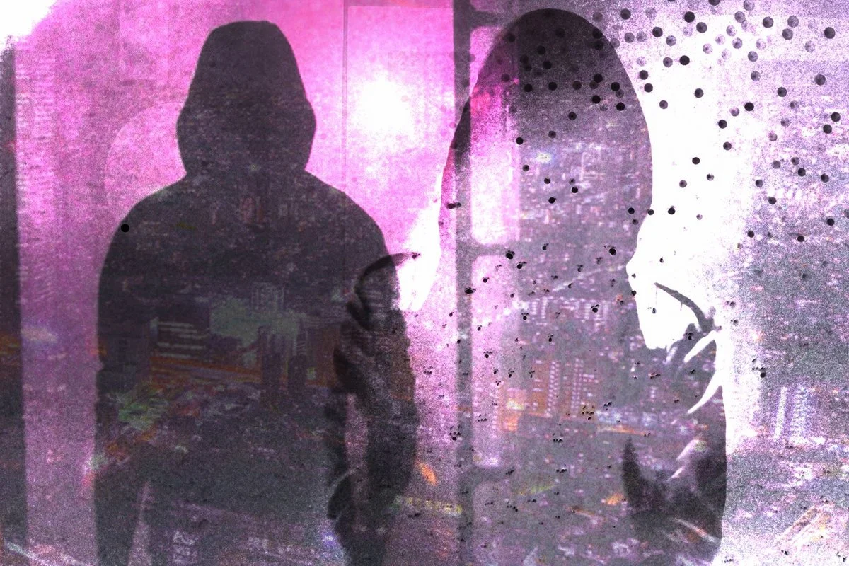
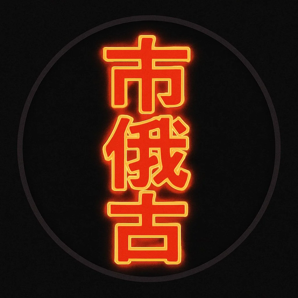
2024: Godzilla Gala
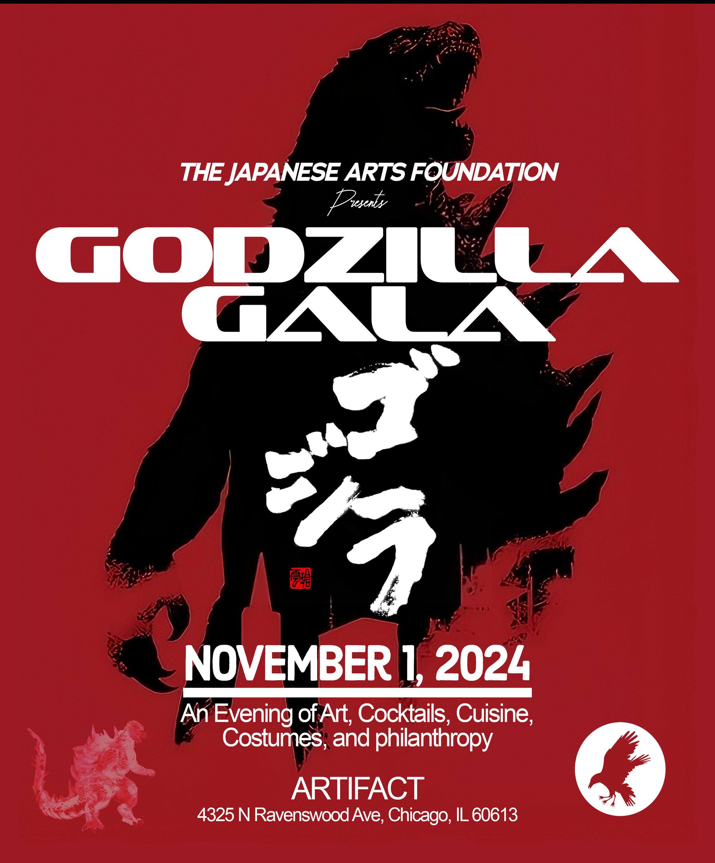
The Concept: Godzilla (ゴジラ). A true pop-culture icon, but also a deeply serious cultural symbol—a metaphor for nuclear anxiety, the unstoppable power of nature, and a strange, destructive kind of resilience.
The Design: This was the outlier. It was a costume gala. It had to be bold, loud, and immediate. The subtlety of previous years was intentionally replaced with raw graphic power. The color palette was a stark, alarming red, black, and white. The typography was custom and "kaiju-sized"—blocky, heavy, and fractured. The centerpiece is the iconic silhouette, which contains the Japanese kanji for 'Godzilla' in a rough, calligraphic style. This wasn't just a poster; it was a warning siren.
The Vinyl: This was, without question, the most fun set to put together. The music had to be theatrical, bombastic, and a little bit destructive (in a good way). I pulled out the heaviest funk-driven City Pop, the cinematic tracks with huge horn sections, and anything with a relentless bassline. This was a night for Junko Ohashi's "Dancin'" and the more high-energy, rock-influenced side of the genre. The music was big, it was dramatic, and it was designed to make a room full of people in costumes feel like they were in the movie.
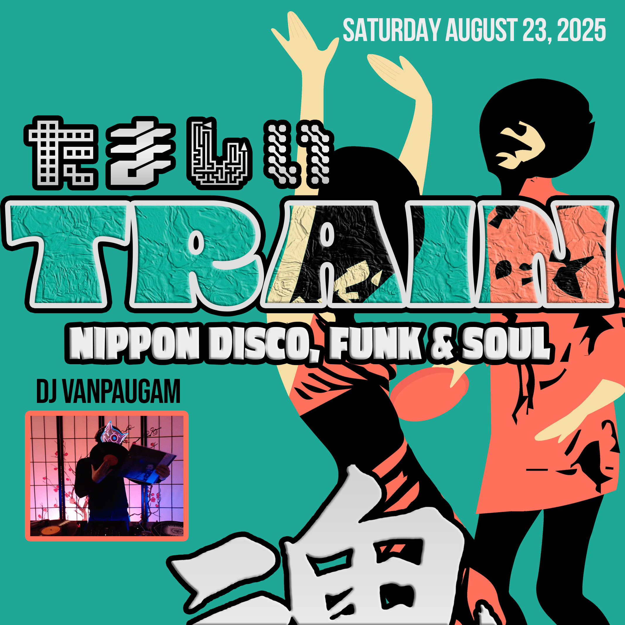
2025: Kaizen Gala
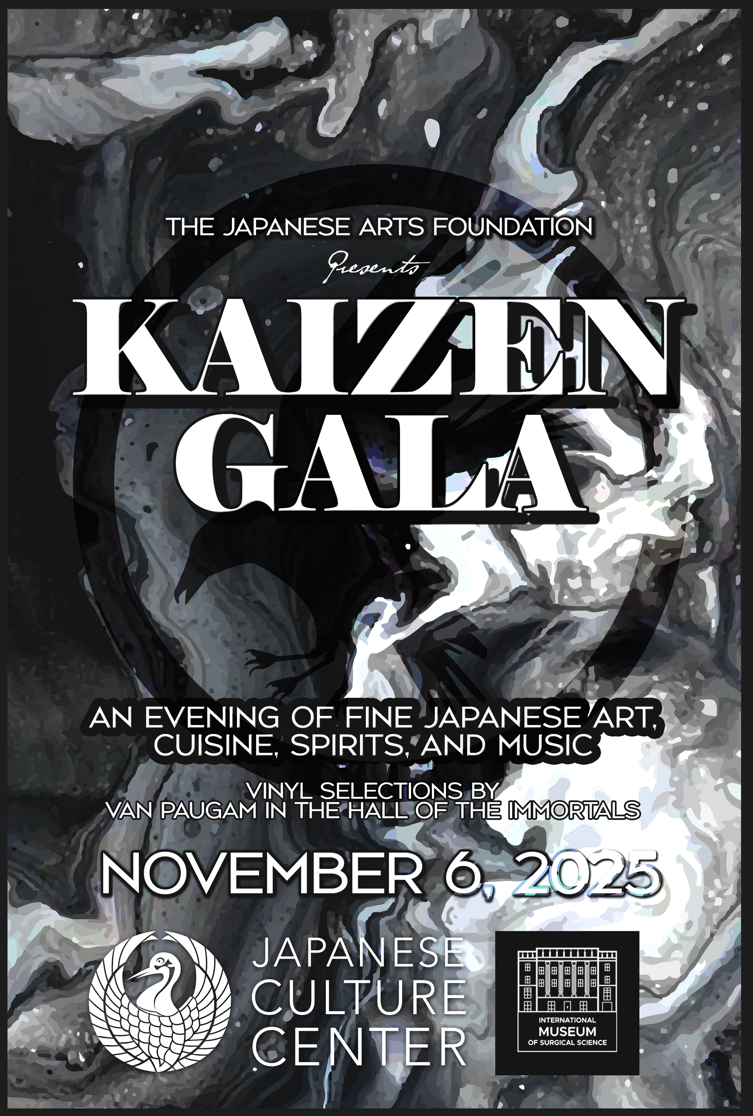
The Concept: Kaizen (改善), the philosophy of "continuous improvement." It's not about a single, revolutionary change, but about a constant, evolving process.
The Design: This year's flyer, for the upcoming gala, feels like a synthesis of everything that came before. It’s both abstract and grounded. The black-and-white art has the feeling of a classical sumi-e (ink wash painting), but it’s chaotic, modern, and in motion. It’s not a static image; it is a process. It feels like something is forming, improving, and changing right before your eyes. The typography is layered, integrated into the art itself. It’s a return to the International Museum of Surgical Science, but also at the Japanese Culture Center, and the design reflects that blend of tradition and modernity.
The Vinyl: The poster explicitly names me and the "Vinyl Selections in the Hall of the Immortals." The music is no longer just atmosphere; it's a listed feature. For a theme like Kaizen, the set has to be a journey. It must demonstrate progression. My plan is to build the set meticulously, starting with more minimalist, ambient sounds from the '70s and gradually, continuously, improving and iterating—layering in funk, then disco, then pure, polished '80s pop. It will be a set that evolves over the night, a direct sonic reflection of the Kaizen philosophy.
Few tickets still remain for Kaizen Gala here
This four-year run has been a privilege. It's a rare opportunity to build a world, year after year, alongside an organization doing such important work. Each gala is a snapshot of a moment, a concept, and a community.
My part is to create the visual and sonic bookends for the experience—to design the cover of the book, and then to write its soundtrack. I can't wait to see what concept we get to tackle next.
– Van Paugam


AUTHOR
Van Paugam is a successful Internationally-Acclaimed DJ and leading figure specializing in 70s and 80s Japanese Music, dubbed City Pop. He has organized and hosted over 100 events dedicated to the style, and actively works for the Japanese culture center of Chicago, while working closely with the Japanese Arts Foundation of Chicago. He has been featured on CNN, NHK, and many other publications for his dedication to City Pop. Van is credited with being the first person to begin popularizing City Pop online through his mixes on YouTube in 2016, and subsequently through live events. Learn More…